
Why Have Rents Risen So Much Faster in Some Parts of Ashford?
Two tenants living only a few streets apart could have experienced very different levels of rent growth over the last decade.
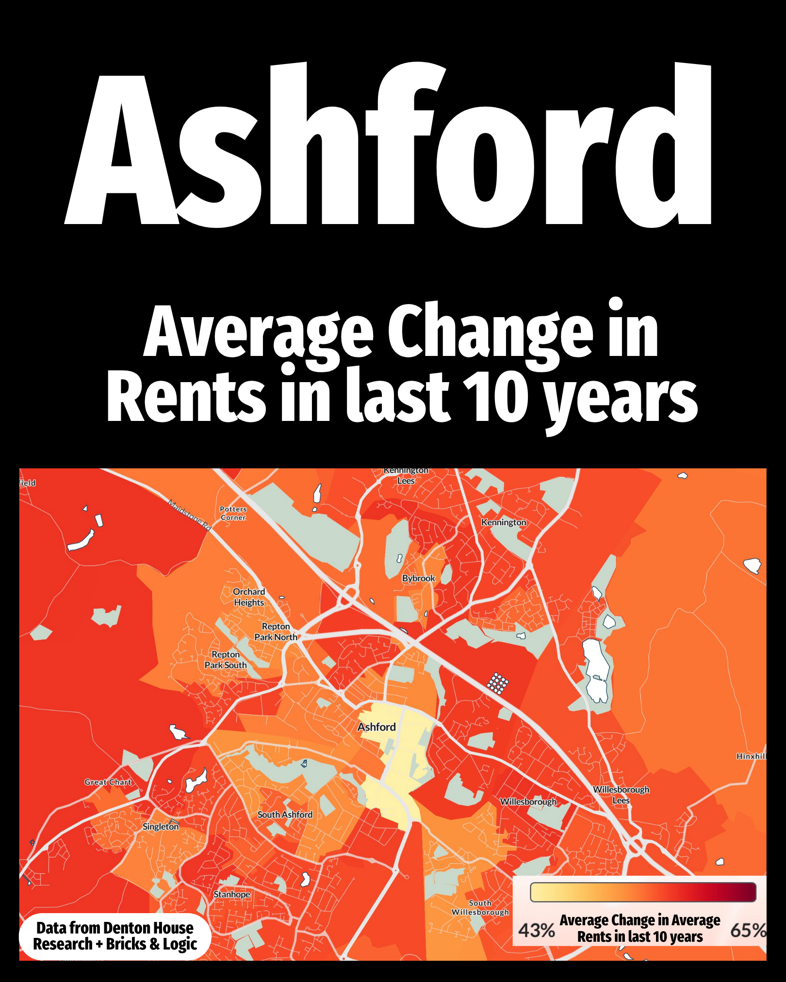
This map shows the average change in rents over the past 10 years, broken down into small local areas. The darker red areas have seen the strongest increases, while the yellow areas sit towards the lower end of rent growth.
What makes it interesting is just how local the rental market can be. Demand for certain property types, proximity to employment, schools, transport links and the changing mix of homes available to rent can all influence what tenants are prepared to pay.
It also shows why quoting one single figure for the whole of Ashford can sometimes hide more than it reveals. Two neighbouring areas can experience noticeably different rental markets, even though they share the same town name. For landlords, tenants and anyone interested in the local property market, the real story is often happening street by street.
Two tenants living only a few streets apart could have experienced very different levels of rent growth over the last decade.
This map shows the average change in rents over the past 10 years, broken down into small local areas. The darker red areas have seen the strongest increases, while the yellow areas sit towards the lower end of rent growth.
What makes it interesting is just how local the rental market can be. Demand for certain property types, proximity to employment, schools, transport links and the changing mix of homes available to rent can all influence what tenants are prepared to pay.
It also shows why quoting one single figure for the whole of Ashford can sometimes hide more than it reveals. Two neighbouring areas can experience noticeably different rental markets, even though they share the same town name. For landlords, tenants and anyone interested in the local property market, the real story is often happening street by street.